I was the Senior UX/UI Designer at Point.me, a real-time search engine that makes it easy to book flights with points. The search engine allows you to view available reward flights across multiple airlines and compare all your options within minutes. One consistent area of concern for the app was its search loading speeds. Point.me’s competitors leaned on cached data, which was lightning-quick in loading but wasn’t always 100% up-to-date. Instead, Point.me used a comprehensive search that scrubbed the internet for the most accurate results. This method was thought to be a standout feature, but after intensive user research and feedback, it was revealed to be more of a deterrent. In the end, users simply wanted faster loading times. My leading goal centered around enhancing the search results to surpass competitive standards and improve the overall user experience. I heavily relied on Hotjar for the data analysis and Figma for prototype designs.
“
My leading goal centered around enhancing the search results to surpass competitive standards and improve the overall user experience.”
Problem Statement
One of the major factors we wanted to keep in mind was allowing the interface to feel familiar and not sway too far from the classic search results page. We didn’t want the visuals to be jarring to the user; but be different enough to be intriguing. I initially designed the search results to load in a brand new table layout, with the different types of flight classes (business, economy, etc.) being separated. After some reviews and testing, it was concluded that while this change felt intuitive, it was too drastic of a difference.
Research
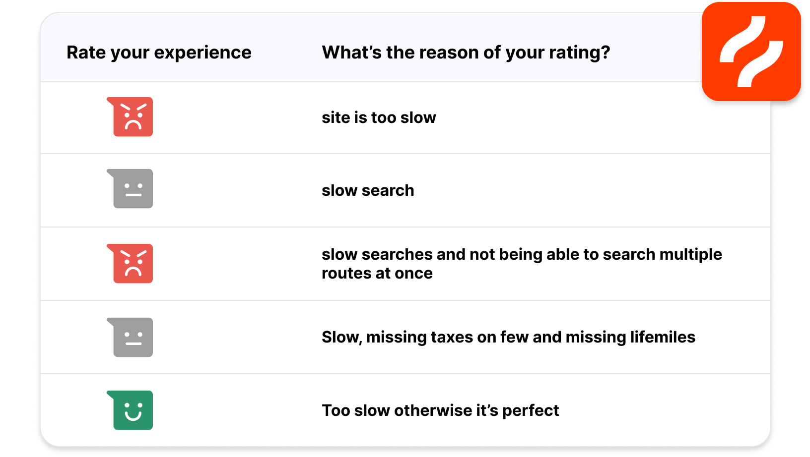
Using Hotjar, I captured user patterns from different heatmaps. From the data provided, I was able to understand the most preferred user flows for flight searching. In addition, I utilized a widget from Hotjar to use on Point.me’s website to gather feedback. It was found that the most common complaint amongst users was in fact the loading speed of the search results.
Solution
In the end, me and the team at Point.me came up with a workaround to the loading speeds issue. We adopted the competitors’ cached-data method, but maintained the comprehensive search method as an option for more seasoned users. This gave users the option to get lightning-quick results that may not be 100% accurate, but still allowed them to dig deeper for the most up-to-date flights. To help promote this change, it was decided to market it as a new feature (called “QuickLook”). Designing the interface was a challenge since I wanted to find a balance between the classic layout vs something new. After getting feedback during our testing stages, it turned out that having a layout similar to the classic look was more favorable, thus making the interface design changes more subtle overall.


Among some other projects, I also designed a new “Our Services” page to break down pricing and all the features of Point.me


