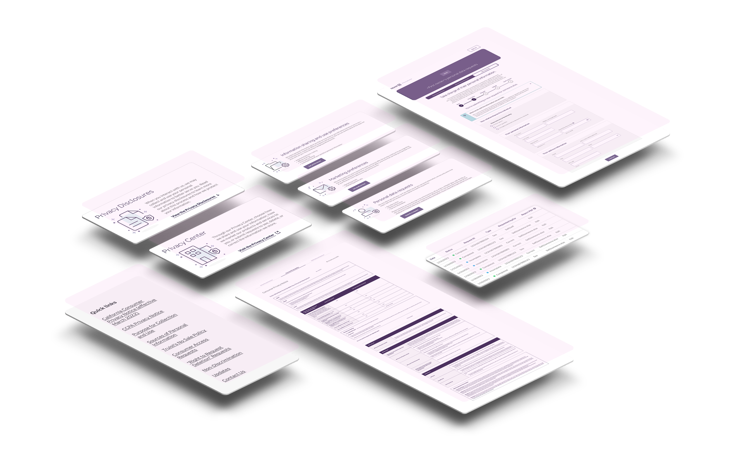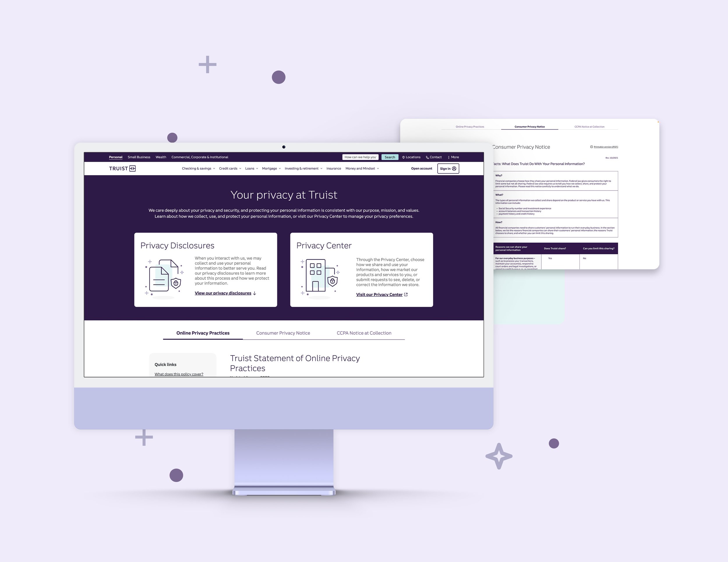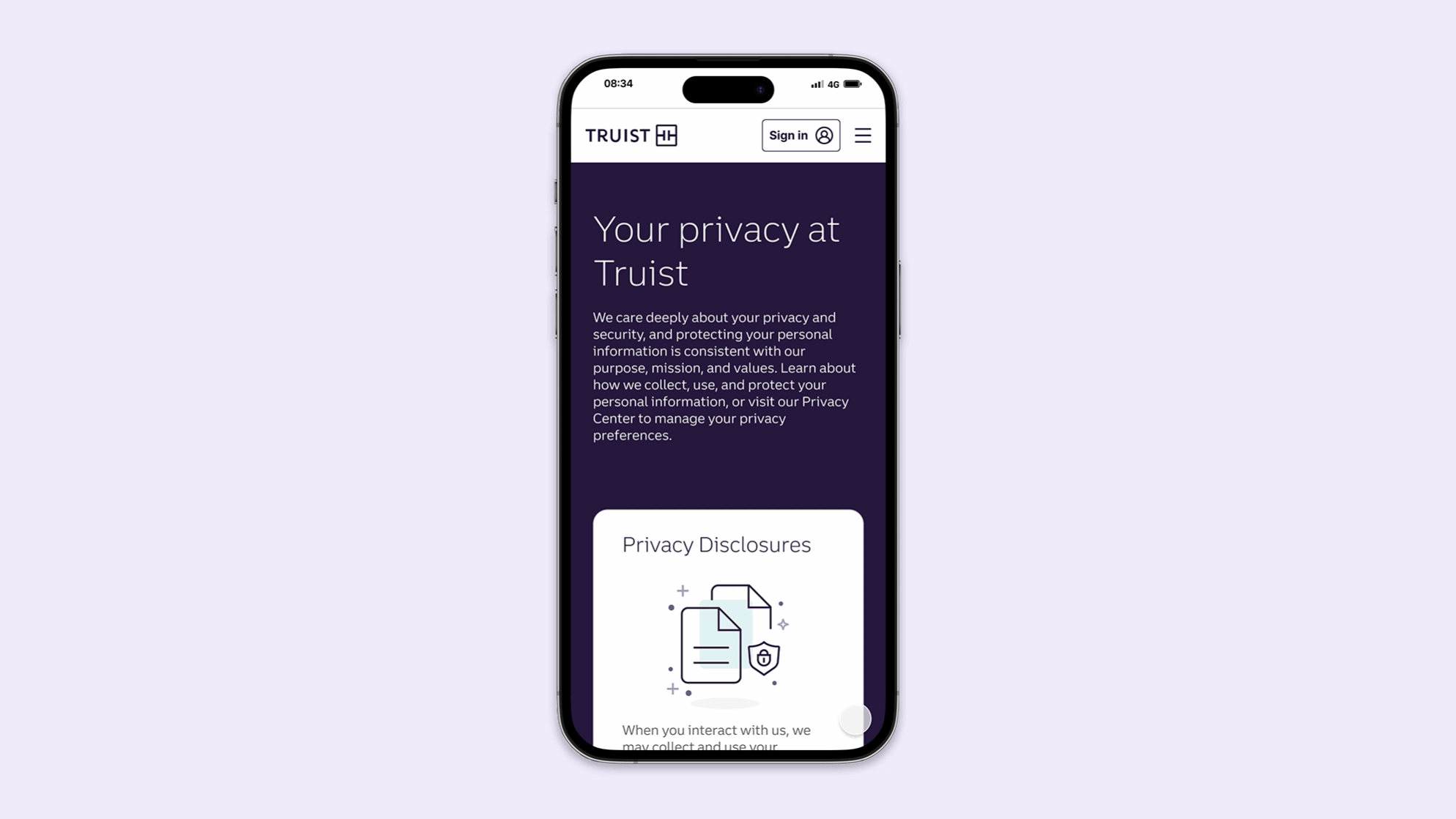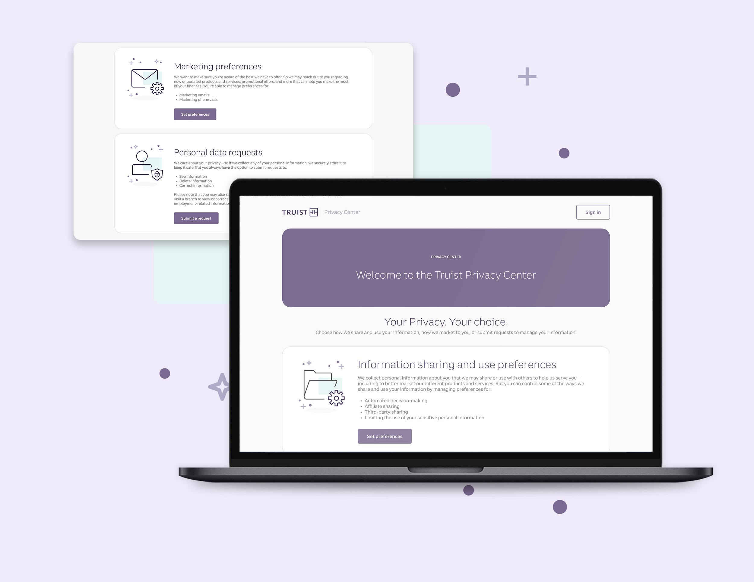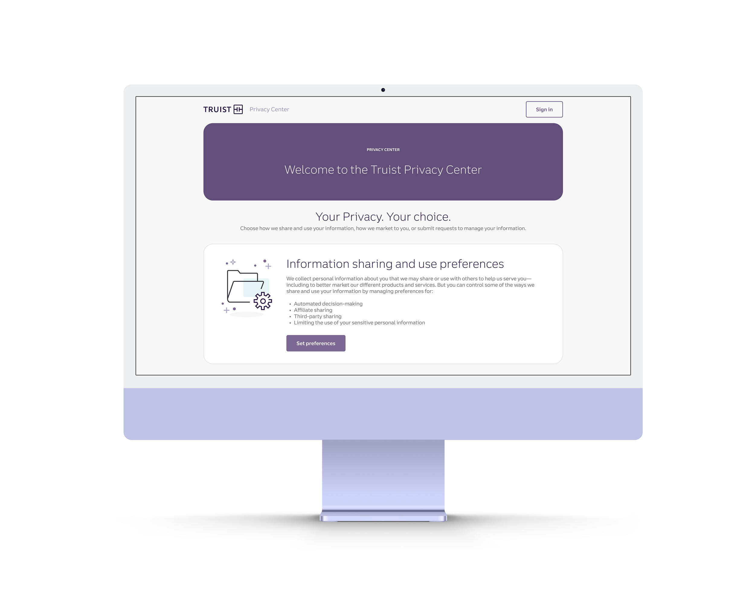
The Truist Privacy Center houses all privacy preferences for users online. As Lead UX/UI Designer, I was tasked with re-structuring all of it, improving both its visual language and functionality. Based on thorough research and various testing models, I made wireframes and prototypes for user flows using Figma and the website’s design system. I also utilized Miro boards for displaying wireframes and gathering ideas and feedback from team members. I often collaborated with UX research, the content writing team, and the compliance team to formulate ideas based on user needs and legal requirements.
“
I was tasked with re-structuring all of [the Privacy Center], improving both its visual language and functionality.”

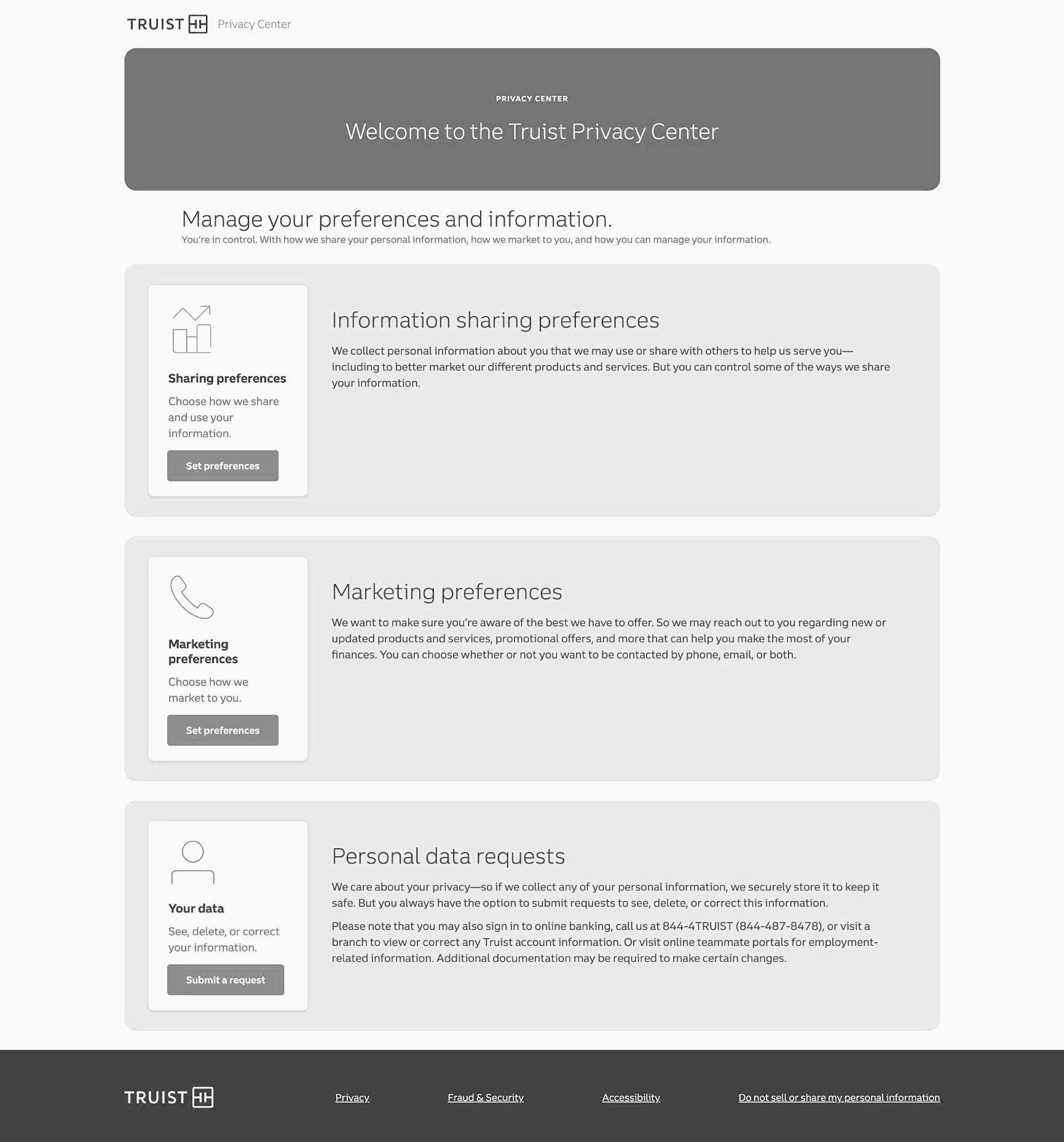
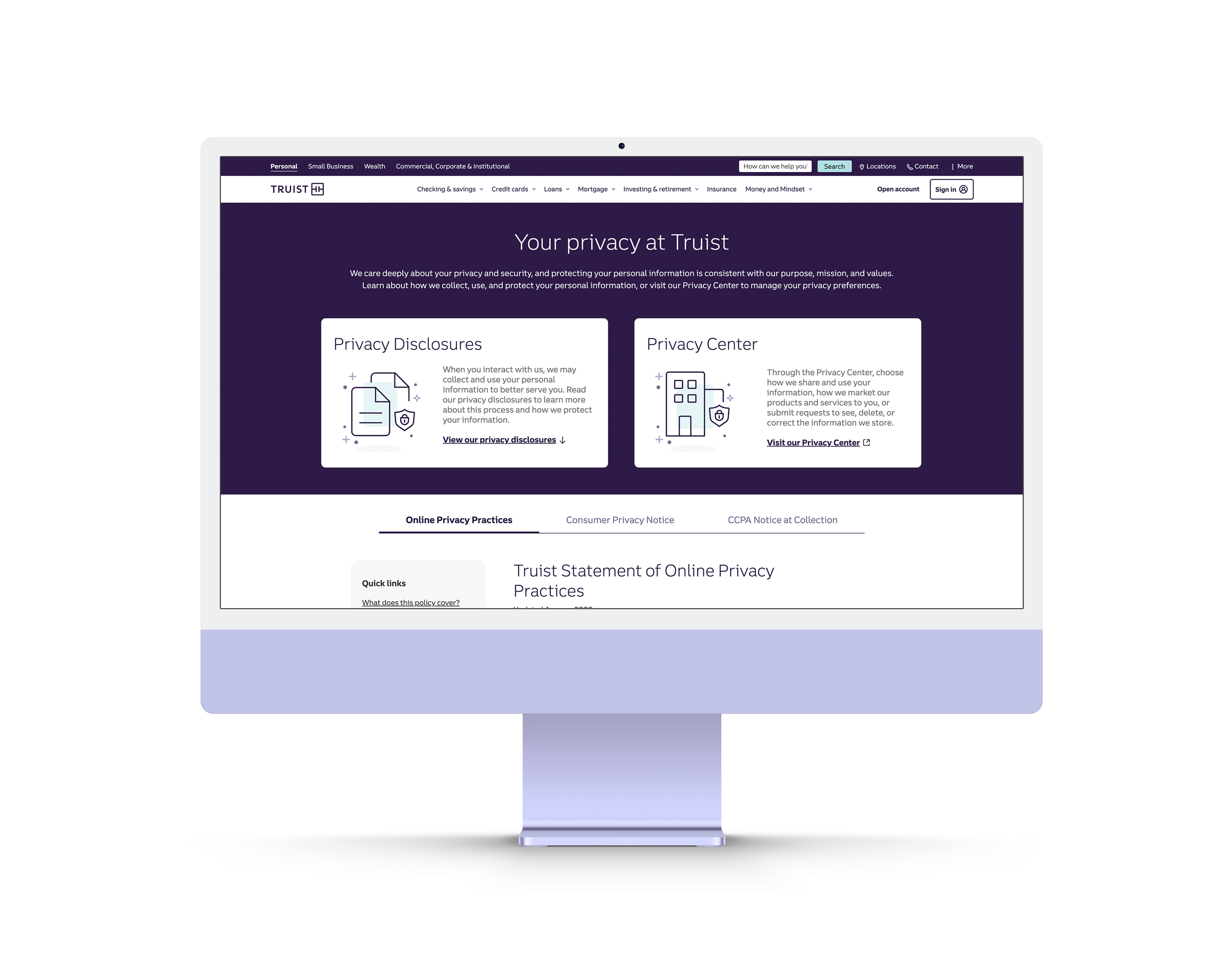
Problem Statement
A glaring issue with the original Privacy Center was the functionality of it. The content was arranged using accordion style menu, which didn’t suit the well for the sections that had large amounts of text. This was especially a nuisance if you clicked on a section with large text toward the bottom (see example pictured), as the page would jarringly move the large body of text into place. This was found to be an overall unpleasant user experience. Additionally, while collaborating with Truist’s compliance team, it was made clear that the desire was to avoid hiding content (something accordion menus inherently do). So it was imperative for my team to find a solution that followed that criteria.
Research
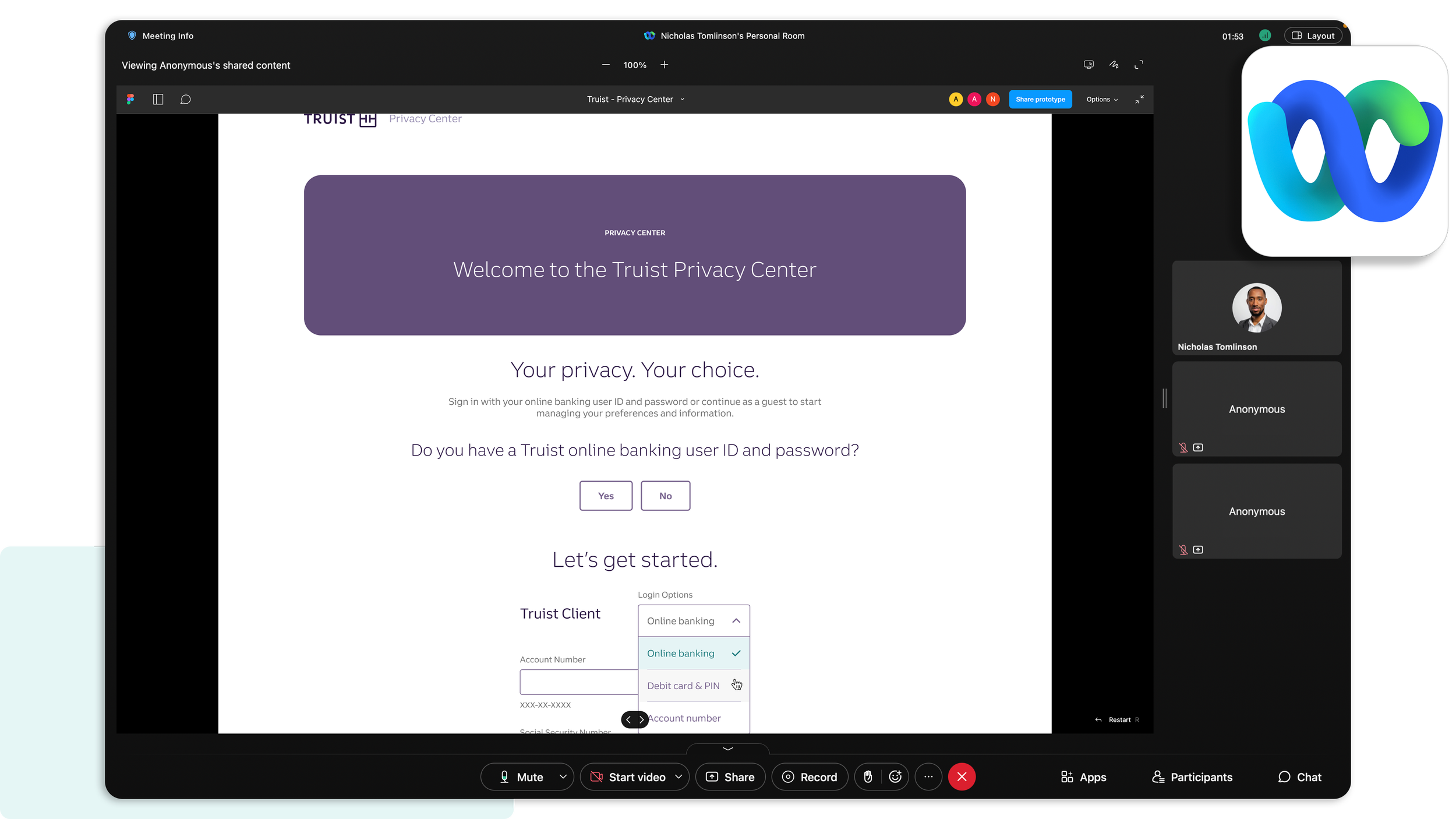
I collaborated with my team’s UX Researcher to find the best practices for privacy in the financial services industry. We compiled our findings and used them to guide my design decisions. After the initial wireframes were completed, we conducted some user tests via Webex virtual meetings. A selection of users each had their own sessions to click through an interactive prototype I created while I observed and gathered feedback. This helped cement the final designs, making necessary changes based on the user testing results.


Solution
To resolve the issues with functionality, the new design maintains the tab buttons up top, but replaces the accordion menu with a sticky side menu filled with anchor links (called “Quick links”). This quick and easy access lets the user jump to the corresponding sections on the page, making way for easier navigation and that also didn’t hide content—a welcomed sight to both the compliance team and users alike.